Custom Label with multiple styles in TextField of Fluent UI

By default Fluent UI TextField component as a label for the field renders plain text and you can not apply multiple styles to several parts of it. But if you want to write a comment after the field name, for example, (maximum 50 characters), you can't do it.
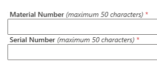
So, we want to write the label "Material Number (maximum 50 characters) *"
And we want to apply different style to the title "Material Number" and make italic "(maximum 50 characters)".
The standart implementation of the component make the whole text the same.
	<TextField
	  required
	  label='Material Number (maximum 50 characters)'
	  maxLength={50}
	  value={material}
	  onChange={(_, value) => materialUpdate(value)}
	  disabled={false}
	  autoComplete='off'
	/>
But you can override the behavior of the rendering the label with onRenderLabel. The example is below.
	<TextField
	  required
// 	  label='Material Number (maximum 50 characters)'
	  onRenderLabel={() => (
		<span>
		  <span style={{ fontWeight: 500 }}>Material Number</span>
		  <span style={{ fontWeight: 'normal', fontStyle: 'italic' }}>
			{' '} (maximum 50 characters)
		  </span>
		  <span style={{ color: '#d13438', marginLeft: 4 }}>*</span>
		</span>
	  )}
	  maxLength={50}
	  value={material}
	  onChange={(_, value) => materialUpdate(value)}
	  disabled={false}
	  autoComplete='off'
	/>
 Net 10.0 is not available for Azure Functions. How to fix
 Custom Label with multiple styles in TextField of Fluent UI
 First impressions after using the new SPFX 1.22.2 with Heft