PowerBI. Add the arrows UP and DOWN

To add the arrows UP and DOWN for a visualization of data changes in Power BI report, you can use this DAX function. It can help you to make a table more descriptive.
Enter your dataset, add new measure and insert the code like this:
IconGrowOrReduce =
VAR PositiveIcon = UNICHAR(9650)
VAR NegativeIcon = UNICHAR(9660)
VAR result = IF( [Data2023] - [Data2022] > 0, PositiveIcon, NegativeIcon)
Return result
'Data2023' and 'Data2022' are the column titles, replace them with yours.
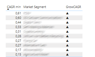
You can also use these arrows:
LEFT: UNICHAR(9664)
RIGHT: UNICHAR(9654)
 Write Number as it is in Microsoft Power BI Desktop widget
 Rename table in MS SQL Server
 How to rotate text in Excel cell on 45 degrees