The customizing of Tabs control from ANTD

I like the Ant Design of React and for me it’s very useful. Usually I prefer functionality to a better design and it allows me to achieve a functionality much faster. But when you do something not for yourself, you have a customer and he decides which design better.
The post is not about thinking but about the specific customizing of the Antd control Tabs. I wanted to use it at one page of my personal site. And even I could see that it looks not pretty 🙂
Default code for tabs looks like:
<Tabs defaultActiveKey="1" items={items} type='card' />
You have the Tab functionality, but background color for active tab is white, for non-active grey.
In documentation I could find a control property ‘tabBarStyle’. And with it the Tabs started to look better.
<Tabs defaultActiveKey="1" items={items} type='card'
    tabBarStyle={{ display: 'flex',
        justifyContent: 'left',
        margin: '0px',
        backgroundColor: "#d0dde1" }} />

but I couldn’t find the way how to change the styles for the active tab.
With developer tools I could see the html code of the component and I decided to modify its styles with SAAS.
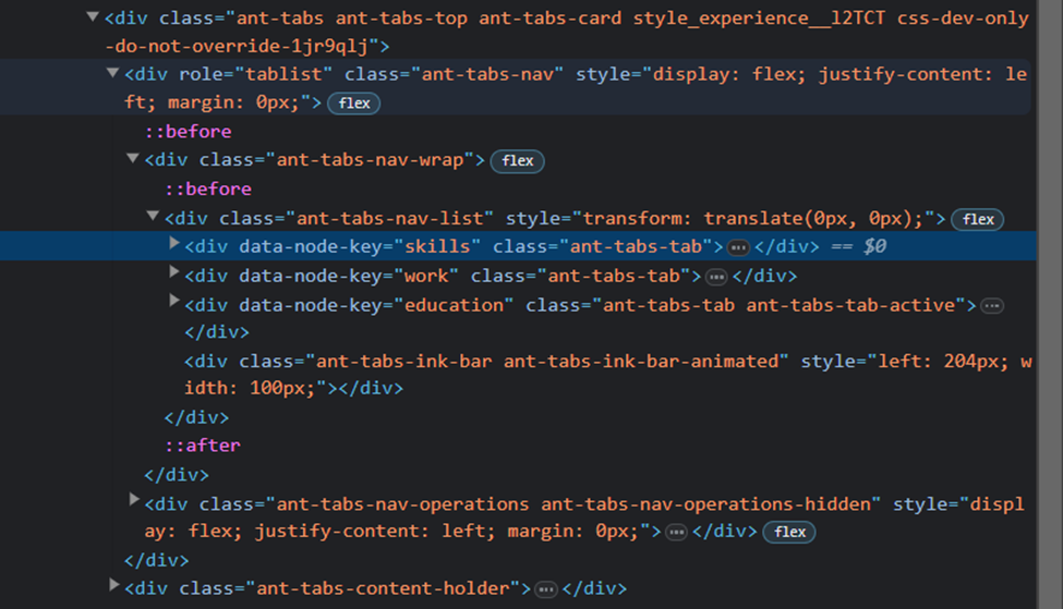
.experience {
  display: block;

}
.experience > div:nth-child(1) {
  display: block;
  border-bottom: $bgSelected 5px solid;
}
.experience > div:nth-child(1) > div > div> div:not([data-node-key=""]) {
  border: none;
}

.experience > div:nth-child(1) > div > div > div {
  background-color: $bgNonactive;
  border-top-right-radius: 5px ;
  border-top-left-radius: 5px ;
  padding: 3px 10px 3px 10px;
  margin: 0px;
  min-width: 100px;
  width: auto;
  display: block;
  color: $maintTextColor;
  font-weight: normal;
  text-transform: lowercase;
  white-space:nowrap;
  border-left: $nonActiveLightLinkColor 1px solid;
  border-bottom: $bgSelected 1px solid;
  &:hover {
    background-color: $bgSelected;
  }
}

.experience > div:nth-child(1) > div > div> [class*="ant-tabs-tab-active"] {
  border: $nonActiveLightLinkColor 1px solid;
  background-color: $bgNonactive;
}
Some comments:
div:not([data-node-key=""]) - means ‘for div which contains non empty attribute ‘data-node-key’

.experience > div:nth-child(1) > div > div> [class*="ant-tabs-tab-active"]  - if attribute contains class ‘ant-tabs-tab-active’
 Net 10.0 is not available for Azure Functions. How to fix
 Custom Label with multiple styles in TextField of Fluent UI
 First impressions after using the new SPFX 1.22.2 with Heft